At PortCity, we’re excited to unveil a milestone we’ve been eagerly anticipating—the launch of our fresh brand identity and the revamped website that comes with it. If you’ve been following us closely, you might have caught glimpses of this creative journey in our new newsletter design, updated templates, swag, stationery, and marketing toolkit. Today, we are proud to introduce our reinvigorated brand voice and design to the world.
Our Brand Voice: Honest, Informed, and Relatable
Our brand tone is a reflection of who we are:
- Honest and Informed: We are grounded in knowledge and expertise, always striving to provide you with the most accurate and trustworthy information.
- Grounded, but Passionate: While we are passionate about what we do, we remain down-to-earth, making complex topics easy to grasp.
- Open and Refreshing: We embrace transparency and bring a fresh perspective to every conversation.
- Conversational, yet Concise: We’re here to have a chat, but we also get straight to the point. Our tone is friendly and approachable.
We are the relatable experts, striking the balance between knowledge and approachability, inviting you to engage with us, ask questions, and grow together as true partners.
Visual Elements that Define PortCity’s Brand
Our brand rollout introduces distinctive visual elements that underline our commitment to excellence. Key features include:
- Black & White Photography: We’ve adopted a unique black & white treatment for our photos. This high-contrast style with deep shadows ensures both visual appeal and clarity.
- The “P” Mark and Wave Design: Look out for our iconic “P” mark and wave design, symbolizing fluidity and forward momentum.
Typography: The Cornerstone of Our Identity
Typography is at the heart of our brand identity. Consistency in its usage is vital for a unified brand experience. We’ve carefully selected fonts—IMB Plex Mono, IMB Plex Sans, and Inter—and applied them thoughtfully across our materials to maintain brand integrity.
Color Palette: Bold and Memorable
Colors play a powerful role in crafting a visually harmonious brand. We’ve developed a distinctive PortCity color palette featuring bold, contrasting shades like pure red, white smoke, and onyx. These colors will remain consistent across all our marketing efforts, ensuring our brand stands out and remains recognizable in a crowded marketplace.
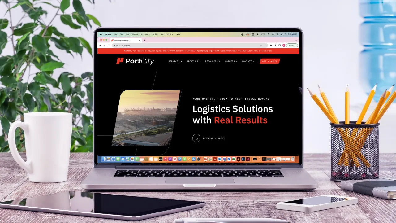
A User-Focused Website Redesign
In addition to our brand updates, we’ve invested significant effort in enhancing the user experience (UX) of our new website. Recognizing the importance of easy navigation and accessibility in the digital age, we’ve meticulously designed and crafted our website for a seamless and intuitive experience. Whether you’re looking for information, insights, or ways to optimize your supply chain, our new website serves as a hub of knowledge and resources.
Explore Our New Website Today!
We invite you to experience our brand-new website firsthand. Discover how PortCity can help you optimize your supply chain and access valuable insights. It’s a reflection of our commitment to your success. We’re excited to have you embark on a journey with us toward a more informed, efficient, and vibrant future. Together, we’ll navigate the path to success with clarity, expertise, and a refreshing approach.
Welcome to the new PortCity!